
Cursive F trips people up more than almost any other letter. The loops go in directions that feel wrong at first, the uppercase version looks nothing like its print counterpart, and most worksheets just show a finished letter with zero explanation of how you actually get there.
This guide fixes that. Every stroke is broken down in plain language, no art degree required.
What Is Cursive F and Why Does It Look So Different?
Letter of cursive writing refers to the handwritten, connected form of the letter F used in flowing cursive script. Unlike print F, which is built from straight lines, the cursive version uses loops and curves that allow it to connect naturally to the letters beside it.
That loop at the bottom of the lowercase cursive f? It’s not decorative. It’s the exit stroke, the part that connects the letter to whatever comes next in a word. Most confusion comes from not knowing that each part of the letter has a job.
According to the Education Data Initiative’s 2023 analysis, 41 U.S. states have now reintroduced cursive writing into K–8 curricula. That means millions of children are learning this right now and millions of parents are being pulled into helping, often with no background in how cursive strokes actually work.
Here’s the thing: once you understand the stroke logic, cursive F becomes one of the more satisfying letters to write.
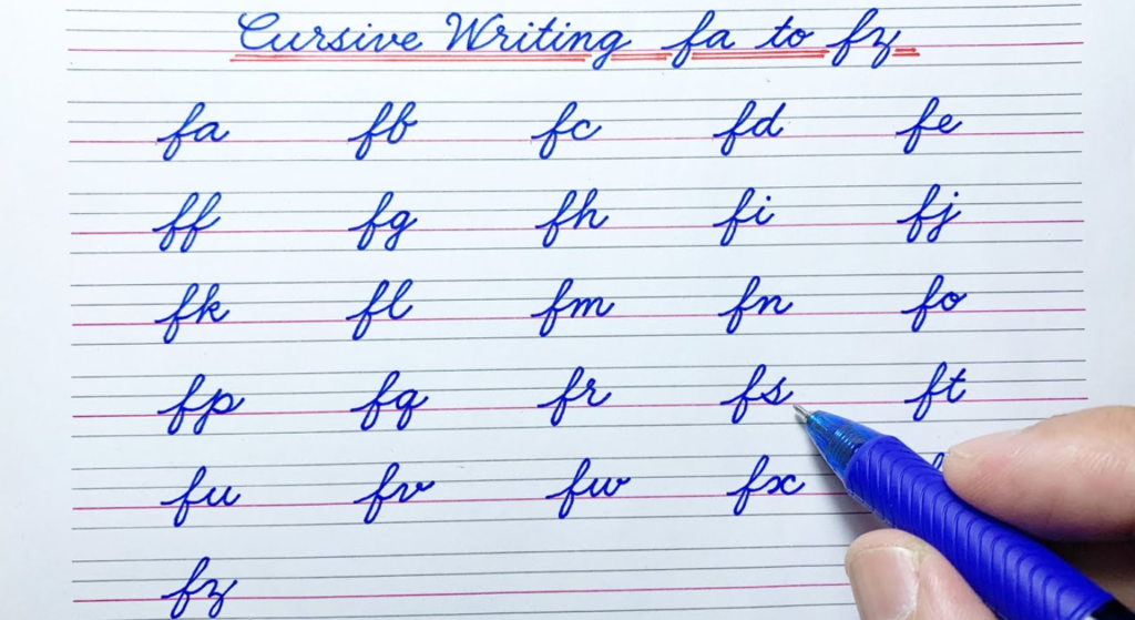
How to Write Lowercase Cursive F Stroke by Stroke
This is where most people get stuck. The lowercase cursive f is one of the few letters that has a loop both above and below the baseline which makes it visually complex but mechanically logical once you see the pattern.
To write a lowercase cursive f, follow these steps:
- Start just below the midline; curve up and right toward the top line.
- Loop left and back down, crossing the midline this forms the upper loop.
- Continue the downstroke below the baseline into the lower zone.
- Curve left and loop back up, crossing the downstroke this is the lower loop.
- Exit right along the baseline to connect to the next letter.
Each step is one continuous motion. Lift the pencil and you’ve broken the connection.
The most common mistake: children loop downward first instead of going up on the initial stroke. If the letter looks like a backward lowercase b sitting on a lowercase j, that’s the problem the entry stroke went the wrong direction.
Quick note: the lower loop should sit about the same depth below the baseline as the upper loop sits above the midline. Equal proportions make the letter look balanced.
How to Write Uppercase Cursive F Stroke by Stroke
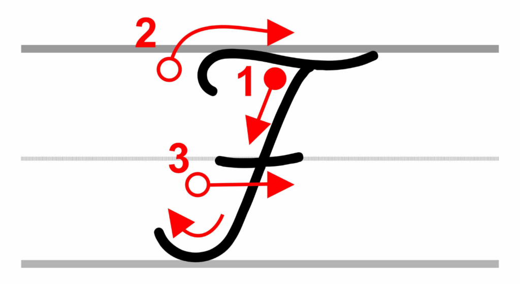
The uppercase cursive F is one of those letters that makes adults do a double-take the first time they see it. It bears almost no resemblance to its printed version.
In most Zaner-Bloser style curricula, the uppercase F looks like this:
- Start slightly below the top line at the left side of the letter space.
- Curve up to the top line and loop right, then swing down to the baseline; this is the main body stroke.
- Add a small curved crossbar at the midline, extending to the right.
- The letter exits at the baseline, ready to connect to a lowercase letter.
In D’Nealian style, the uppercase F begins with a similar looping motion but the crossbar is often simpler and the overall letterform leans slightly to the right. Both are correct, they’re just different handwriting systems.
Or maybe I should say it this way: if your child’s school worksheet looks different from what you find on a random cursive chart online, it’s probably a D’Nealian vs. Zaner-Bloser difference, not a mistake.
D’Nealian vs. Zaner-Bloser Cursive F: Which One Should You Teach?
This is the question neither the TikTok videos nor the generic worksheets bother to answer.
Quick Comparison:
| Style | Best For | Key Benefit | Limitation |
| Zaner-Bloser | Traditional school curricula, formal instruction | Clean loops, widely recognized letterforms | Slightly more strokes, harder for young writers to start |
| D’Nealian | Transition from print to cursive | Closer to print letter shapes, easier progression | Less standard in formal assessments |
| Getty-Dubay Italic | Older learners, speed writing | Fast, efficient, highly legible | Not traditional cursive — uses fewer loops |
| Handwriting Without Tears | Early learners with fine motor challenges | Multi-sensory approach, structured curriculum | Requires specific materials for full effectiveness |
Some experts argue that Zaner-Bloser is the correct standard because it dominates formal handwriting assessment rubrics. That’s valid if your child is being graded. But if the goal is legibility and the development of a lifelong handwriting habit, D’Nealian’s gentler learning curve often produces better long-term results especially for children who struggled with print first.
Common Mistakes When Writing Cursive F (And How to Fix Them)
Users who’ve tried worksheets without instruction often report the same cluster of errors. Recognizing the mistake is half the fix.
Mistake 1 The loop goes the wrong way.
On the lowercase f, the upper loop should go counterclockwise. If it goes clockwise, the letter looks like a distorted print f. Remind the learner: Loop left, not right.
Mistake 2 No lower loop at all.
Many children stop at the baseline and don’t bring the stroke down into the lower zone. The lowercase f should dip below the line of similar depth to g, j, or y.
Mistake 3 The crossbar is missing or misplaced.
Both uppercase and lowercase cursive F need a crossbar at the midline. On the lowercase, this happens naturally as the downstroke crosses itself. On the uppercase, it’s a separate small stroke. Skipping it makes the letter unrecognizable.
Mistake 4 Lifting the pencil mid-letter.
Cursive is one continuous motion per letter. Any lift creates a gap that breaks the flow and makes the letter look like two separate marks.
What most guides skip is this: fixing these mistakes requires slowing down first, then speeding up. Writing slowly on a large scale (try lined poster paper or a whiteboard) builds muscle memory before moving to normal-size practice.
Practice Tools That Actually Help
Three resources worth using each serves a different need.
K5 Learning offers free printable cursive F worksheets with tracing lines. They’re well-structured for classroom use. The limitation is that they provide no stroke instruction, just the finished letterform to trace. Use them after reading this guide, not before.
Handwriting Without Tears is a full curriculum used in thousands of U.S. schools. Their approach is multi-sensory; they use wooden pieces, chalkboards, and specific verbal cues to teach stroke direction. If a child is struggling consistently across multiple letters (not just F), this curriculum is worth looking at seriously.
Cursive Generator lets you type any word and instantly see it rendered in cursive script. This is particularly useful for showing a child what a full word looks like when the cursive F connects naturally to the next letter, something static worksheets can’t demonstrate.
FAQs
Q: What’s the best way to teach a child to write cursive F?
A: Start with the lowercase stroke sequence on a large surface whiteboard or oversized paper. Practice the upper loop and lower loop separately before combining them. Use verbal cues like loop left, go down, loop back up to anchor the motion.
Q: How do I write a lowercase cursive f step by step?
A: Begin below the midline, curve up and loop left to form the upper loop, drive the stroke down below the baseline, loop left again to form the lower loop, then exit right along the baseline to connect to the next letter.
Q: Why does cursive F look so different from print F?
A: Cursive F is designed for connected, flowing writing. According to handwriting curriculum guides, the looped structure allows the letter to link to adjacent letters without lifting the pen, something straight-line print letters can’t do efficiently.
Q: Should I teach D’Nealian or Zaner-Bloser cursive F?
A: Match whatever style your child’s school uses. If unsure, check the worksheet header most school-issued materials label the style. According to Handwriting Without Tears research, consistency in style matters more than which style you choose.
Q: When should I introduce cursive F to my child?
A: Most curricula introduce cursive letters in 2nd or 3rd grade, around ages 7–9. However, children with strong fine motor skills can begin earlier. Start with letters that have simpler stroke patterns like c, a, and o before moving to more complex letters like F.Look , if your child has been staring at a cursive F worksheet for twenty minutes and it still looks like a collapsed pretzel, that’s not a learning problem. It’s an instruction gap. The stroke logic was never explained. Now it has been.